Selected work
What I do
Brands and teamsProximo Spirits, Lipton, Tazo, Tommy Hilfiger, Toda, 1800 Tequila, Jose Cuervo, Gran Coramino, Bushmills, Pendleton Whisky, American Crew, Usagi, Time Out Market, Teachers College, Columbia University
Featured case study · Tazo Tea
Tazo's Amazon presence relied on static image pages that undersold the brand and gave search very little to index. I led the redesign end to end. I developed a new page architecture and wireframe, art directed the visual system, and built and published all eight pages in Amazon's Store Builder.
Each page pairs a bold lifestyle banner with live product grids under a consistent masthead and navigation. Video and recipe content add searchable text and more paths to purchase.
Each page was a set of flat PNGs. Text inside the images was invisible to search, and shoppers had few ways to reach a product.
One wireframe drives every page: campaign hero, category tiles, live product grids, video and recipes, all in Tazo's color and photography.
Real text and live product modules give Amazon something to index, and every section leads to a product page with Add to cart one tap away.
Case study · Gran Coramino Tequila
For the launch of Gran Coramino, I worked with the director, the senior brand manager and the wider brand team to design the below-the-line program, covering point of sale, e-commerce, tour and fleet graphics, print and events.
A bold condensed wordmark and a strict black-and-silver palette let the crystal bottle and Kevin's portraits lead every piece. Gold is held back for the Añejo line and the "Hard Work Tastes Different" campaign.
Case study · Walmart brand shops
I designed and launched brand shops on Walmart.com and the Walmart app for Jose Cuervo, 1800 Tequila and Pendleton Whisky, taking each one from wireframe through asset production to the live page.
All three share one modular wireframe: a brand hero, story cards, a product family lineup and recipe modules that put the spirit, mixers and bar tools in the same basket.
Case study · American Crew
For American Crew's 2016 Elvis Presley campaign, I designed most of the work, from the special-edition product packaging and merchandise to the ads, runway show graphics, campaign microsite and print collateral.
The work stays in black, white and silver so Elvis's archive photography leads, and "The King of Men's Grooming" script lockup ties packaging, apparel and event graphics together.
Case study · Usagi
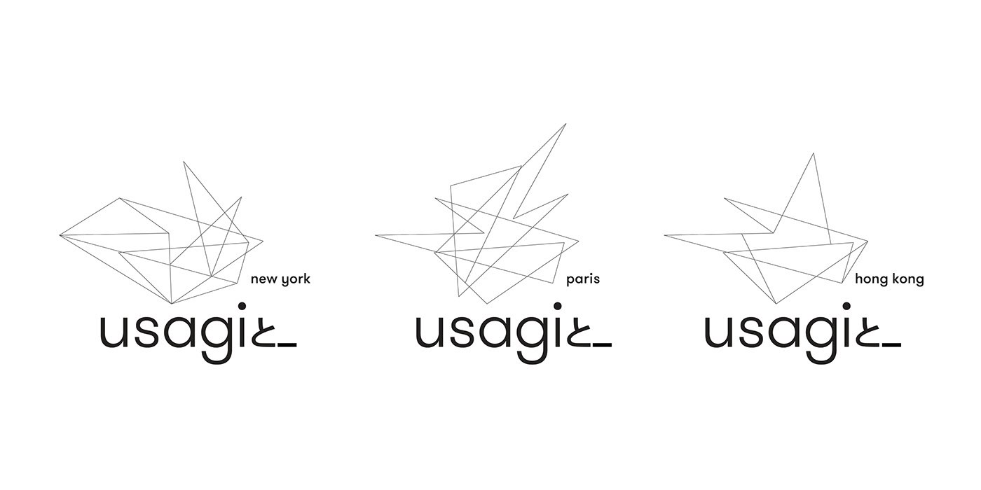
Usagi is a Japanese café, shop and art gallery with locations in New York, Paris and Hong Kong. I led the redesign of its brand identity.
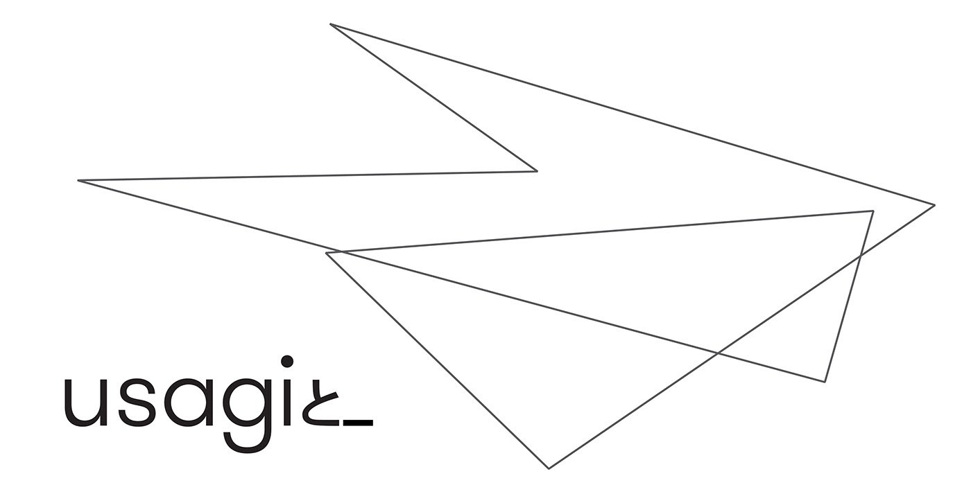
The new core mark is drawn from Usagi's original rabbit logo. Each city's logo grows out of that same core mark, so it sits, unchanged, inside every location's logo.
A single continuous line, drawn from the original rabbit.
Each location adds its own lines to the core mark. The highlighted shape is the same core mark in all three logos.
The system across stationery, signage and the New York storefront.
Case study · Instacart brand stores
I designed brand stores on Instacart for 1800 Tequila, Maestro Dobel, 400 Conejos and Bushmills Irish Whiskey, plus a multi-brand page for the "Cristalinos Shine Brighter" collection.
Every store pairs a sponsored brand banner with shoppable product rows and recipe cards, so each cocktail leads straight to the bottles in it. Each brand keeps its own look: black-and-white recipe cards for 1800, tennis-court graphics for Dobel's US Open cocktail, warm illustrated cards for 400 Conejos and cream recipe cards for Bushmills.
Choose a brand to see its store.
Case study · E-commerce and display ads
A selection of e-commerce, display, social and email ads for spirits brands including 1800 Tequila, Gran Coramino, Proper No. Twelve, Jose Cuervo, Bushmills, Pendleton, Centenario, The Kraken and Tincup.
The work covers sports partnerships with the 49ers, Jaguars, Raiders, Rams and Knicks, product launches, and retail and seasonal promotions. Each campaign is built as a set, so one idea holds up from a 300 × 250 rectangle to a full-width hero banner.
Case study · Jose Cuervo Reserva de la Familia × MICHELIN Guide
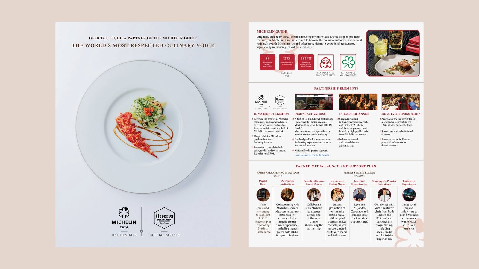
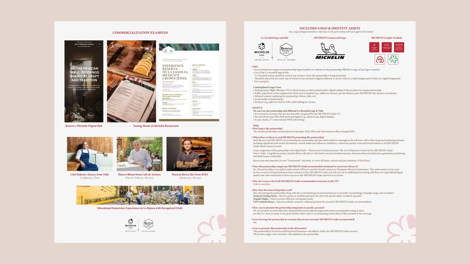
Reserva de la Familia became the official tequila partner of the MICHELIN Guide in the United States. I designed the co-branded logo lockup, the recipe cards and the partnership overview that introduced the collaboration.
The lockup pairs the MICHELIN mark and Reserva's hexagon crest under one divider. The recipe cards and overview use warm cream paper, Reserva's blackletter wordmark and MICHELIN red, so both brands read as equals.
Co-branded lockup
One card per expression, pairing the bottle with how to serve it, from an elevated Old Fashioned to Extra Añejo neat.
A four-page introduction for sales and brand teams: what MICHELIN is, the partnership elements, examples and usage guidelines.


Cover and partnership elements · Commercialization examples and logo guidelines. Click a page to read it full size.
Case study · Lipton Tea Concentrates
When Lipton introduced its new tea concentrates, I created a new set of product listing images for each flavor, the images shoppers click through on the Amazon product page. The same images ran on Lipton's own website.
Every flavor gets the same seven images, from the product hero through real tea leaves, a three-step shake, pour and mix guide, caffeine level and nutrition. Color and ingredients change per flavor, so the set reads as one family.
Case study · Jose Cuervo × UFC
Early in Jose Cuervo's partnership with UFC, the brand needed clear rules for how the two marks appear together. Working with Cuervo's senior brand manager, I designed the partnership lockups and below-the-line identity.
The system covers horizontal, vertical and dark-background lockups for both Cuervo and Cuervo Tradicional, plus an octagon badge that echoes the UFC cage, all built on UFC red, Cuervo's blackletter and a set palette.
Four approved versions for each product: horizontal, vertical, horizontal on dark, and the octagon badge with its color palette.
The lockups applied across arena screens, bar fascia and digital menu boards.
Case study · Tazo × Craig's Cookies
Tazo and Craig's Cookies teamed up on a limited-edition chai cookie, with a $2 Tazo coupon for every cookie sold. I built the hero graphic from scratch, compositing the Tazo Organic Chai box, a glass mug of chai and the cookie into one image.
From that graphic I designed the in-store poster and the Instagram story and feed posts, shared as a collaboration post from both brands' accounts.
The hero graphic, built from scratch
One layout adapted to a tall story, a square post with a corner coupon badge, and the live collaboration post on Instagram.
Case study · Walmart × Lipton
Lipton's iced tea concentrates were brand new, and Walmart shoppers had never seen them. I designed the on-site Walmart display campaign to build awareness at launch, from large on-site units to slim sponsored banners.
Every unit shares one bright Lipton-blue product shot and one simple message, "Shake, pour, mix. Enjoy!", so the product reads instantly at any size.
Reported campaign performance on Walmart.
Hero, tall skyscraper, split and square units, plus the leaderboard and sponsored banner sizes.
Case study · 1800 Tequila × NFL
1800 Tequila is a partner of several NFL teams. I designed the social content for those partnerships: Instagram stories, feed posts and sweepstakes posts for game-day tickets.
Each team gets the same system, "Celebrate Touchdowns with Taste" and "Taste a VIP Game Day Experience", rebuilt in its own colors with a player, the bottle and a co-branded lockup.
Case study · Tazo 2025 holiday season
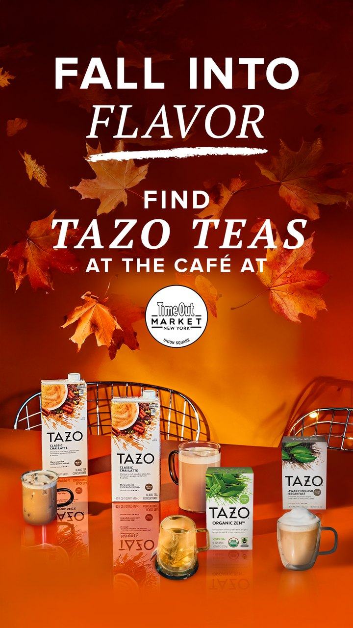
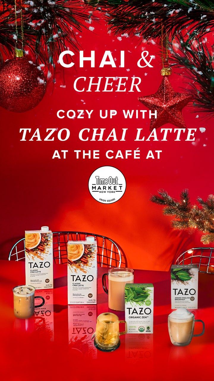
For Tazo's 2025 fall and holiday season, I designed the ads and social assets that sent shoppers to try Tazo chai lattes at the café at Time Out Market New York, with a nudge to find Tazo at retailers nearby.
The work runs as a seasonal sequence, from "Chai Season Is Here" and a pumpkin spice weekend through "Fall Into Flavor" to "Chai & Cheer". One type system carries it all, with bold caps paired with an italic serif, while the color moves from autumn amber to holiday red.


Case study · New Gifts exhibition book
New Gifts was the 2015 Creative Technologies exhibition at the Macy Art Gallery, Teachers College, Columbia University. It brought together 27 artists working where art meets technology, from LED dresses and a knitted radio sweater to gesture-controlled projections. I art directed, designed and produced the full exhibition book.
The cover's overlapping, tinted hands echo the show's interactive work. Inside, a quiet white grid with generous margins lets each artist's images lead, with aqua and violet carried through from the covers.
Artist spreads, installation photography and the cover system.
Contact
I'd like to hear about it. Send a note about the project and the timing.